
Building a visual language
How strong brands become recognisable without trying.

The goal of any brand should be simple:
remove the logo and people still know it’s you.
That doesn’t happen by accident. It’s the result of a visual language built over time.
Consistency. Product. Setting. Mood. Are all part of the equation.
When those things work together, recognisability follows.
You can see this clearly by looking at brands that have committed to it.
You can spot an Aimé Leon Dore image instantly.

Same with Stüssy, who often rely on location, lighting, and environment as much as the clothes themselves.

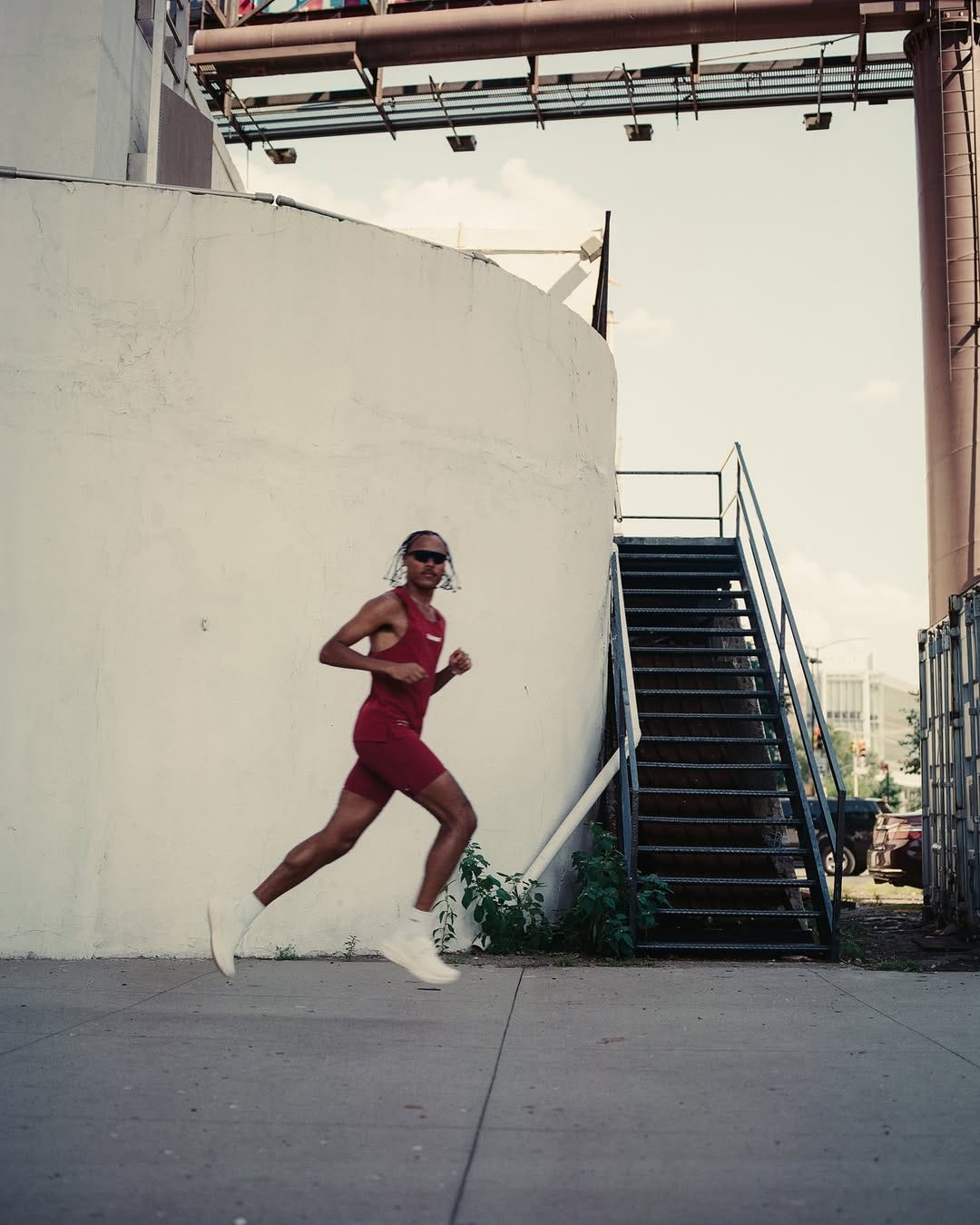
Nike consistently frames athletes as bold, almost mythic figures.

Bandit focuses on movement.
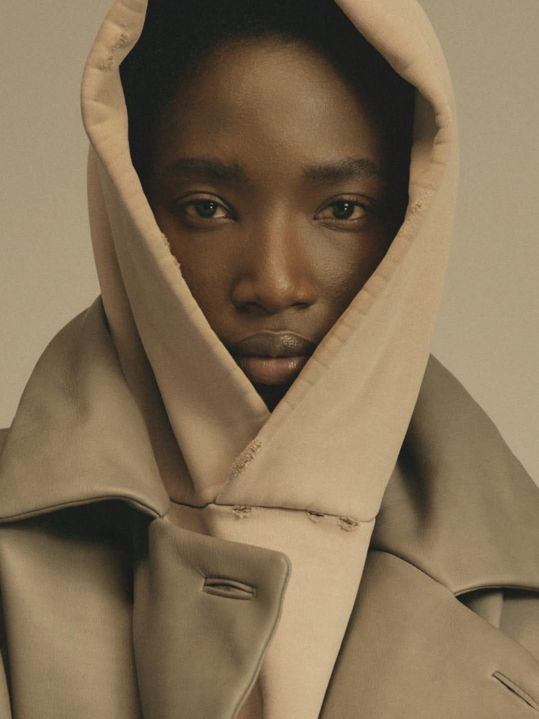
Fear of God strips things back with muted palettes and not showing any personality.
Different brands. Different worlds. Same principle.
What makes this interesting isn’t the aesthetics themselves, it’s the discipline behind them. These brands know what they look like before they execute their campaigns. There is meaning in the decisions, usually reflecting aspiration… especially as the garment's price point rises.
This way of thinking is central to the work I do. Not chasing taste for taste’s sake, but building a visual system that speaks directly to the audience the brand is trying to attract. Personal preference always exists, but it comes behind clarity and intent.
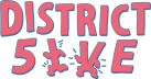
District 5ive is different.
This one is personal. It’s a place where the thinking becomes visible. In this case, I am the audience. That doesn’t mean indulgence, it means honesty. If something doesn’t resonate with me, it doesn’t belong here. If somebody else can post about it, shit.. you don’t need my take as well.
As I’ve started posting again, the focus has been on consistency. Now it’s a thing that is happening, I can give the visuals more time. The aim is that you recognise District 5ive before you see the Keith Haring inspired logo in the corner. The editorial posts are intentional. They’re meant to feel closer to a magazine than a social post.
Slower. Considered. Slightly out of time.
It’s early. Maybe 10% of the way there. But consistency and direction matter more than polish at this stage.
Visual language isn’t about having all the answers upfront. It’s about setting rules, testing them, then refining without losing consistency. That balance is the work.
Email has limitations. Instagram gives more room to experiment. You’ll start to see me push and pull between those two, exploring how far recognisability can travel without losing its core.
That’s the point of this project.
To follow my own tastes, question why and then see what comes of it.
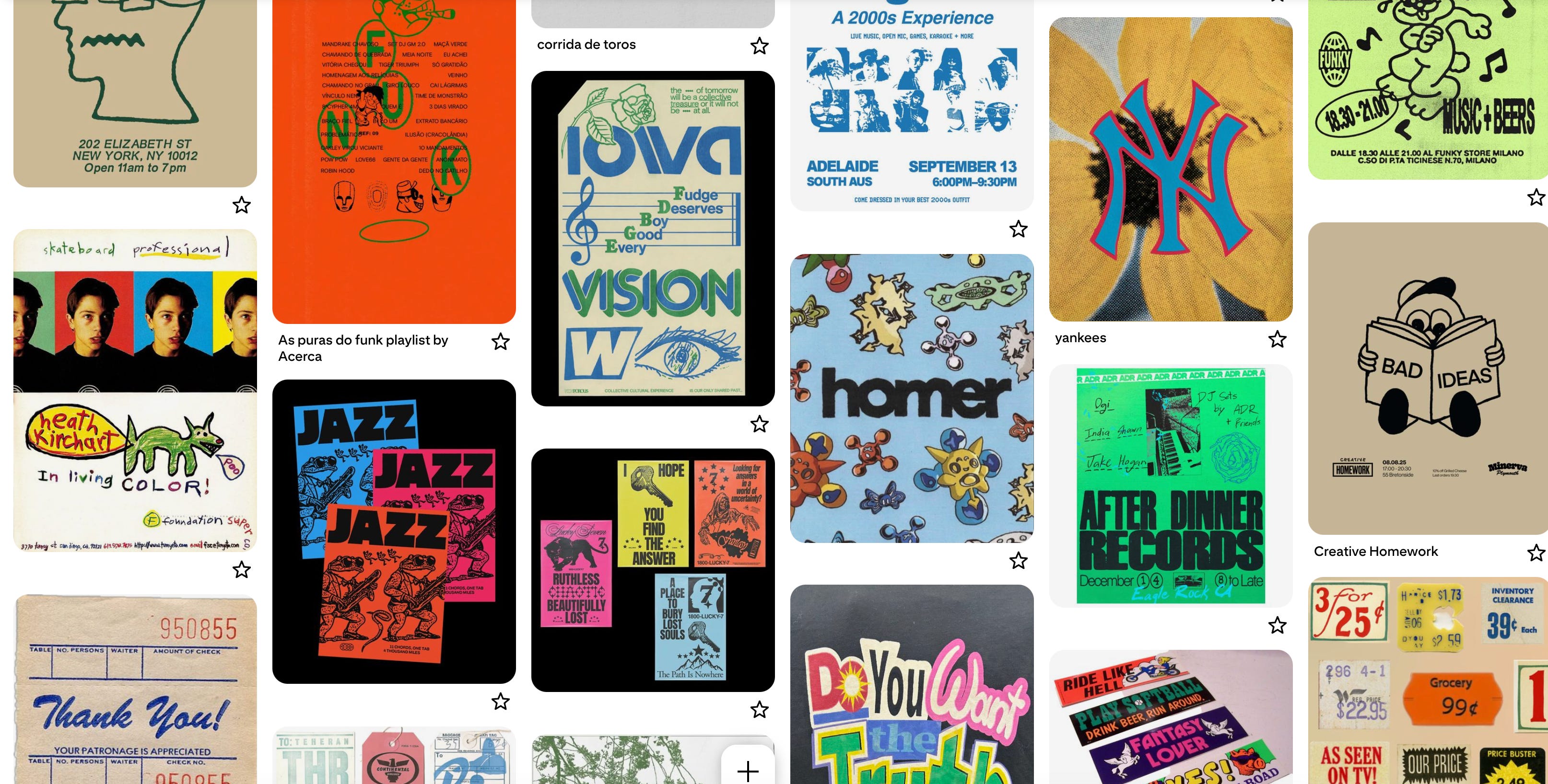
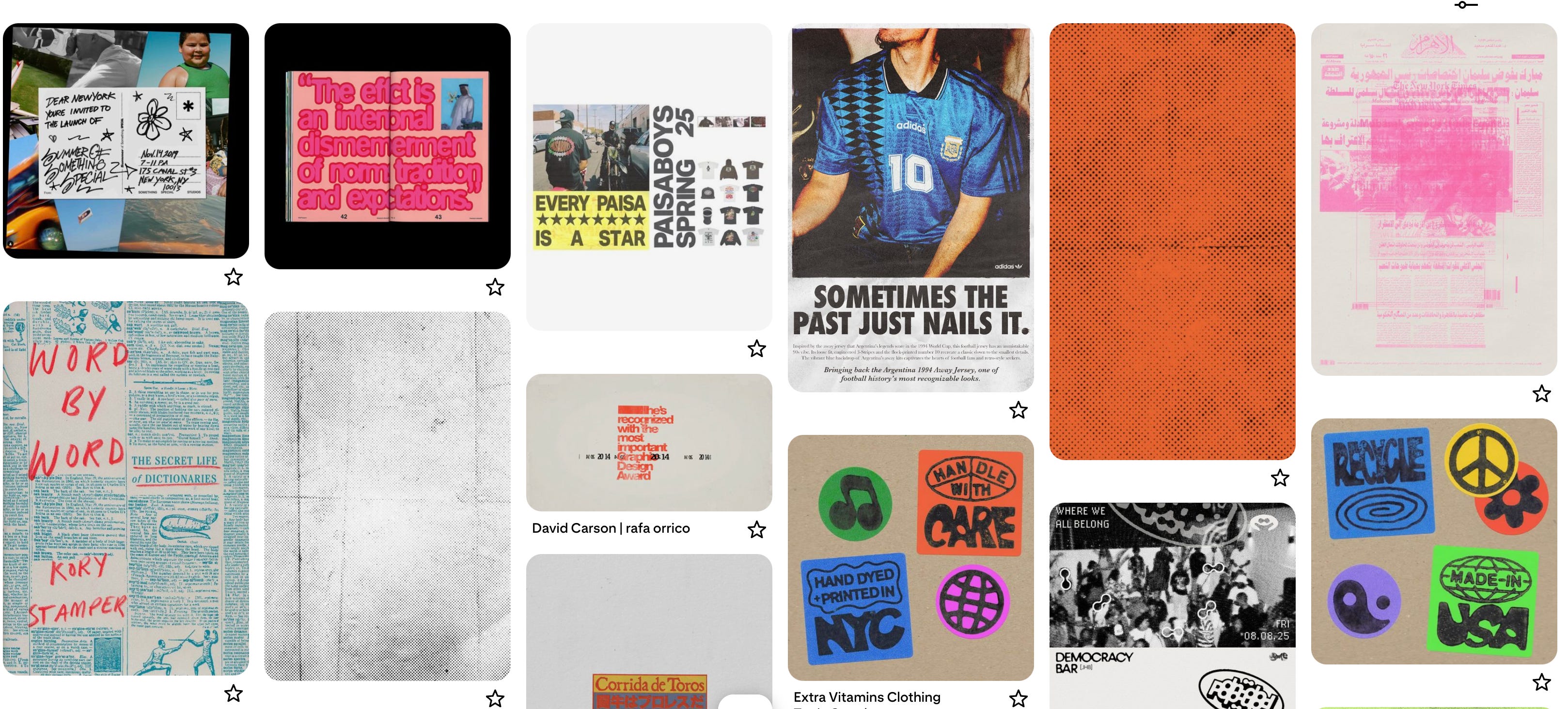
Here are some images I’ve saved that resonate. Not all will survive what eventually becomes a more aligned brand moodboard, but it’s a fun process either way.
As always, thanks for reading.
Hayden
PS. I know some of these topics are pretty heavy in the branding world, but hopefully, it just makes you think a little differently about what you like and why you like it.